Photo Credit: Pantone
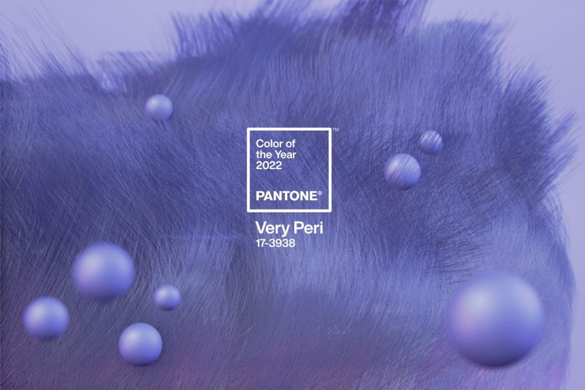
PANTONE HAS ANNOUNCED THE PANTONE COLOUR OF THE YEAR OF 2022 WILL BE "PANTONE 17-3938 VERY PERI"!
The Pantone Colour of the Year elicits some of the most curious reactions from netizens, as it does every year. Very Peri (Pantone 17-3938), a vibrant periwinkle blue with violet-red overtones, has been chosen as Pantone's Colour of the Year 2022. Pantone has developed a new colour for its Colour of the Year programme for the first time.
Photo Credit: tollens
Very Peri is a brand-new Pantone colour that was produced particularly for the year 2022. According to Laurie Pressman, Vice President of the Pantone Colour Institute, this is to emphasise the "global innovation and revolution taking place" in our current environment. This shade's distinctive combination of blues and red violets also indicates the arrival of new opportunities and perspectives.
Photo Credit: Elite Daily
"The Pantone Colour of the Year reflects what is taking place in our global culture, expressing what people are looking for that colour can hope to answer." added Laurie Pressman, Vice President of the Pantone Colour Institute. "Creating a new colour for the first time in the history of our Pantone Colour of the Year educational colour program reflects the global innovation and transformation taking place. As society continues to recognize colour as a critical form of communication, and a way to express and affect ideas and emotions and engage and connect, the complexity of this new violet-red infused blue hue highlights the expansive possibilities that lay before us".
Photo Credit: kompas.com
"As we move into a world of unprecedented change, the selection of Pantone 17-3938 Very Peri brings a novel perspective and vision of the trusted and beloved blue colour family," says Leatrice Eiseman, executive director, Pantone Colour Institute.
"Encompassing the qualities of the blues, yet at the same time possessing a violet-red undertone, Pantone 17-3938 Very Peri displays a spritely, joyous attitude and dynamic presence that encourages courageous creativity and imaginative expression."
Photo Credit: Fox Business
According to Pantone, Very Peri infuses a playful freshness into the home design by energising the room with a distinctive colour combination. Very Peri offers a pop of colour to a variety of materials, textures, and finishes, a painted wall, home décor, or as an eye-catching addition to a pattern because of its flexibility. This tone's mix of blue and red makes it both grounded yet adventurous, allowing it to stand-alone or as part of a new colour scheme. In the year 2022, this is how to combine patterns in a room.
Do you want to mix this fashionable colour with your interior design?
We do provide consultation and help you save money on your interior design by using eBidding.
To get to know more about our service, click here to get a free quote.